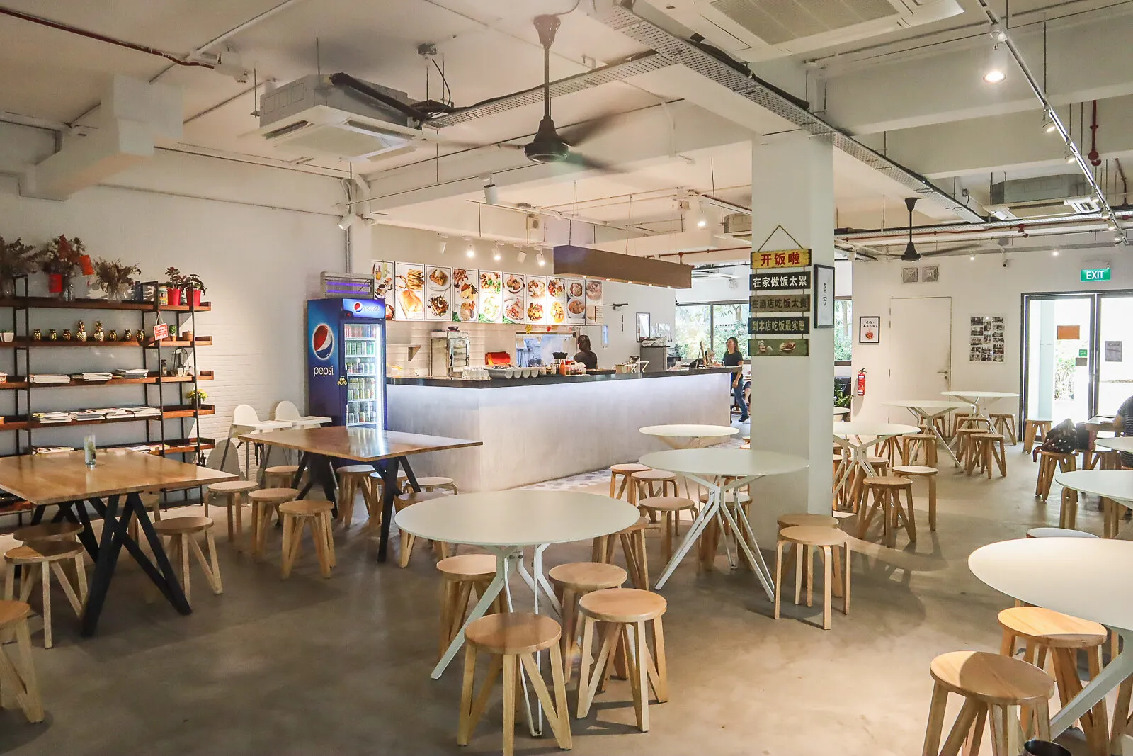
Fashionable interior design is a very fleeting concept. Trends may change once a quarter (abroad). Therefore, choosing the concept for the institution, it is recommended to be based not only on the latest fashion trends, but also on the general idea of a cafe or restaurant. Each place is different cuisine, approaches to business, people who work there and the design only helps to emphasize these chips. Recently, natural materials and industrial motifs prevail in interior decoration. Fashion for simplicity and light roughness has brought negligence in technical execution, which is difficult to write off on the original idea.
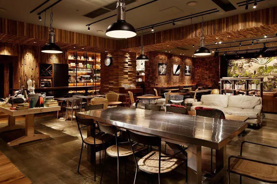
Brooklyn style in the design of restaurants, bars and cafes is chosen for its cheapness and simplicity. However, for the same price you can make a design in a different style, which will not be worse. Now they gradually depart from this style and pay attention to new trends.
Another trend of the last years in restaurant design are halls with common tables and minimum partitions, secluded places, especially bars. Someone finds advantages in this, because people come to the bar to communicate. Not everyone likes these techniques. Many people refuse them and do not even consider the possibility of decorating the design of the restaurant in this style. Recent years have brought more air, replacing the heavy interiors with the philosophy of “cozy”, “all and more” come fresher and simpler, with a minimum of decor and maximum light. For the minimalist design of a cafe, bar or restaurant, quality furniture and decoration is especially important.Sometimes the interior is built around one idea. For example, in the fashionable London art bar “The East Bar” the design is tied on the wall – a huge coloring and chandelier that lets glare on the walls.
Another important trend in interior design of cafes and restaurants is the return of color. Purple, lavender, mint, plum, coral and blue-green shades. Designers are very happy about it, as they are a little tired of pastel, beige, nude and black and white tones.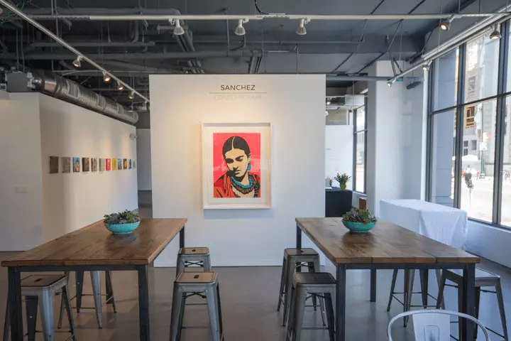
The interior design of bars and restaurants is influenced by contemporary art. Not only galleries with trendy artists, but also popular culture. Many designers draw inspiration from the younger generation, because today it is teenagers who create trends.Art objects also return to the interior. Pictures, panels, sculptures – now they can be found more often. The combination of styles and eras is popular. The fashionable trend was the collaboration of futuristic forms with the traditional solution of planes. For example, the ultra-modern design of sofas in combination with classical molding.
https://www.blucap.in/index.php/blog/coffee-shop-interior
6 Budget friendly ways to make your cafe unique:
Flora galore:
Nothings sings like spring like fresh flowers and a splash of color. While flowers and plants have been making their way into local cafes for some time now, some cafes are taking this to a whole new level. Consider incorporating a leafy feature wall or vertical herb garden to create an outdoor oasis that can be enjoyed all year round.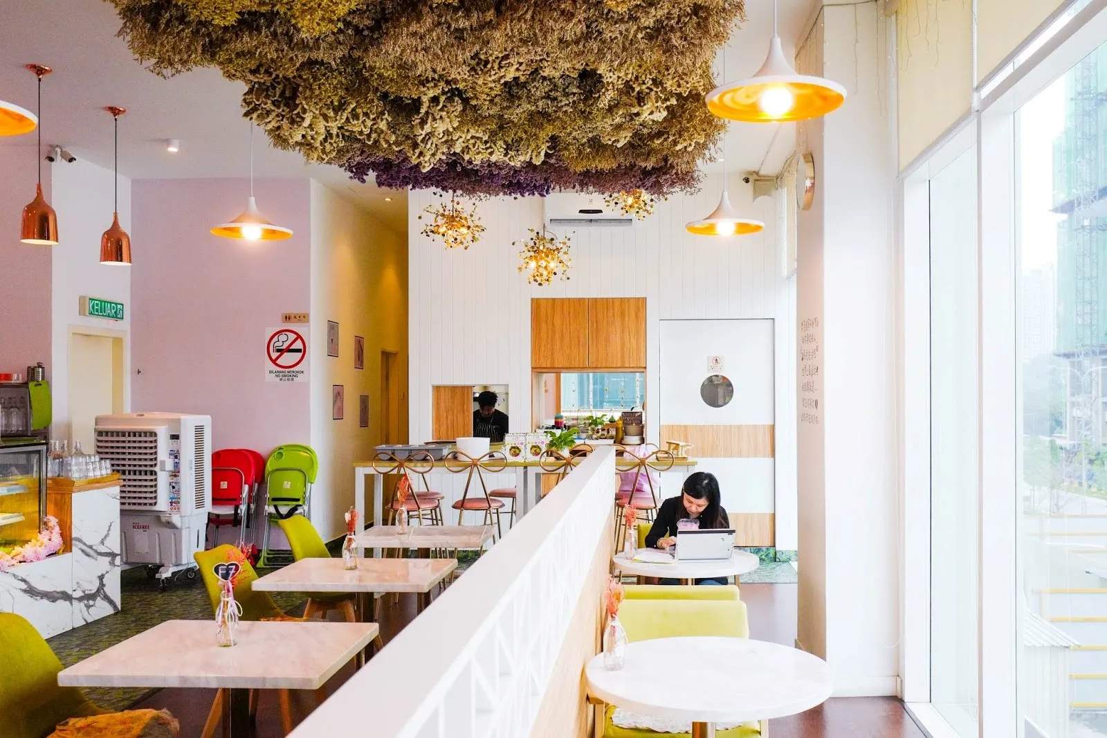
Clashing textures:
Instead of creating interest with colour and patterns, some cafes are opting for a minimalist approach and creating detail with clashing textures. Think up-cycled wood tables, concrete, copper fixtures, marble bench tops, intricate iron bars, crisp white shelves and shaggy pillows. Some cafes go for a rich-kitsch style of decor with unexpected hues, bold patterns, colourful motifs and more. To recreate such an ambience, you, too, can use Indian carvings, geometrical patterns, graphical or floral prints, and any other piece of art or crafts that give a bistro charm to the space. You can also opt for local handloom fabric for the upholstery or local paintings for a more individualistic approach.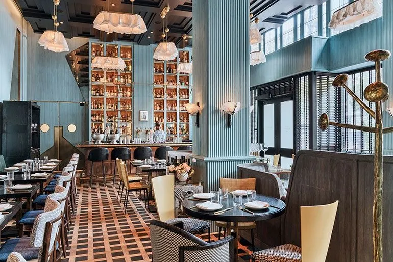
Multifunctional Space
Multifunctional Space as a key trend to consider. As the move to casual dining doesn’t seem like stopping anytime soon, they say that the cafes of the future will serve fast food in a multifunctional space that enhances the coffee experience and provides a comforting ambience. The literal implementation of the program would have been problematic on the building site, as the green passage would have become parking and the building itself would lack dialogue with its surrounding space. By shifting the parking onto the top of the building, the green area can become a pedestrian connection where the main entrance of the library is situated. The roof functions as a public and easily accessible square. The multifunctional hall (exhibitions, functions, lectures…) along the main road and meeting rooms on the “backside” are lifted and can function separately through the roofscape. The ‘roof- square’ acts as a transit space for the flux of cars and people. It folds to get natural light into the underlying spaces. The large open space of the library is formed by the folding planes of the roof and the floor, creating a space of varying volumes. By setting the book collections down, the occupant has an uninterrupted view of the library space. The central circulation-strip services the different collections and is naturally lit (garden, light- pavilion, skylight).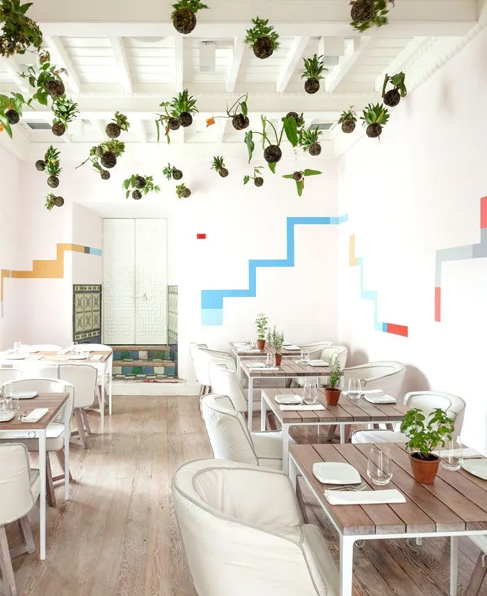
The Open Kitchen
An open kitchen layout lets customers see the action that usually takes place behind the scenes. Any commercial kitchen layout can be turned into an open kitchen by taking down a wall. To ensure guest safety, it’s best to keep hot cooking appliances as far away from customers as possible. A glass partition between the service area and guest seating is a smart choice to protect the food from unexpected sneezes or coughs.A contact – at least a visual one – with the end-users of their work and culinary art is a strong stimulus for the chefs, who thus realize the importance of their job, feeling appreciated, satisfied and motivated to do their utmost. And this is exactly what they do. It is worth noting, however, that this improvement is not only perceived, but it is also an objective one. The researchers have in fact placed an external observer inside the kitchen during the experiment to take note of the particular care and attention taken by the chefs whenever the kitchen was on view to diners.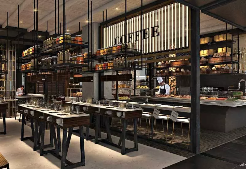
Mixed Use
Newer mixed-use developments usually are more code-compliant and have better facilities. The space is typically built from the ground up and so has been constructed with specific purposes in mind from the get-go.The landlord wants to see your restaurant succeed and may offer leasing incentives.Many mixed-use café go for the “work, play, stay” experience, which offers guests a one-stop-shop. When including restaurant tenants, consider the overall experience you are trying to create. Mixing F&B options into your hotel should provide guests with diverse options for a cohesive dining experience—include options for all three meals and late night. Instead of traditional brick-and-mortar restaurants, you may consider a food hall or public market to increase foot traffic and expand your offerings.
Popular mixed-use developments may also include salons, spas and fitness centers into their properties to create a more relaxing, therapeutic wellness experience. Additionally, it’s necessary to find creative avenues to highlight the entire development. Creating a holistic marketing strategy that accurately reflects your brand and desired image can be an important key in introducing your property and the additional amenities a mixed-use development offers.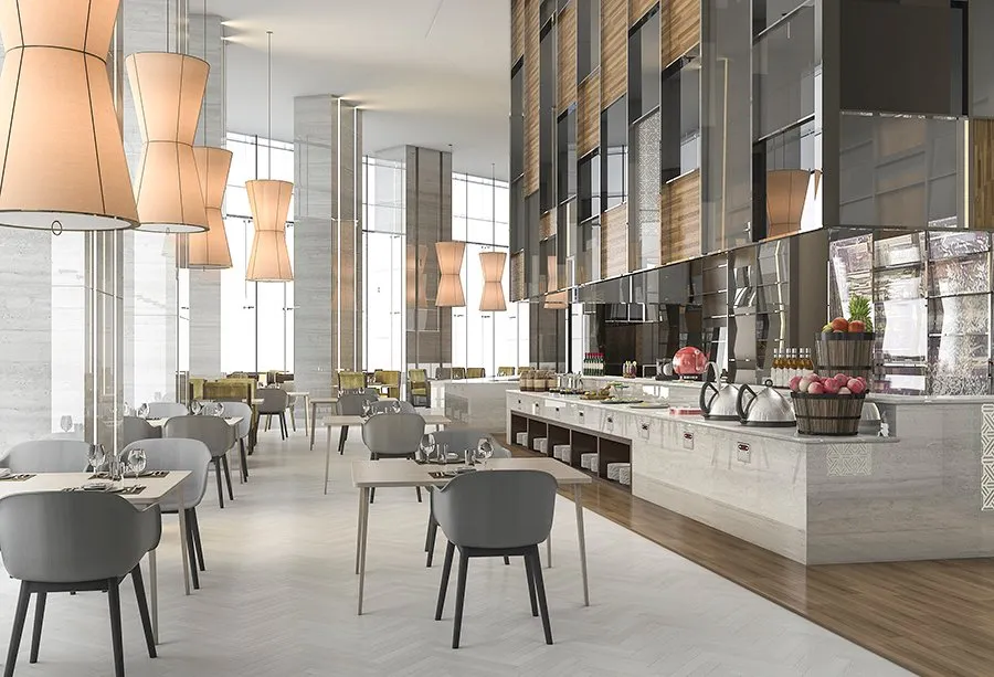
The Living Room Cafe
Coffee shops tend to be well designed... they are trying to draw you in to sit and drink their product, after all. So today we're going to talk about ways to translate those ideas into decor for your own home. the contemporary context of a commercial environment, resulting in a cosy setting in an unexpected place. The coffee and dessert bar, add more value to the retail concept. It also doubles as an intimate co-working space which inspires creativity. It's important to be consistent when decorating your café - you don't necessarily want to go super matchy-matchy, but you'll want to be consistent with color and style from room to room.Use a lot of text in different fonts to draw you closer and direct you to buy their food and coffee.