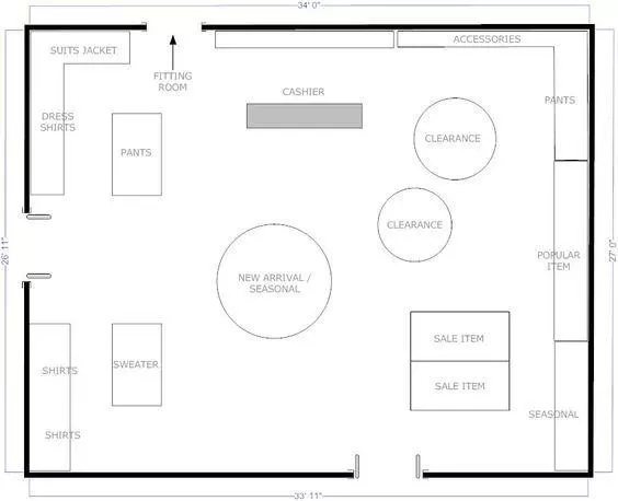
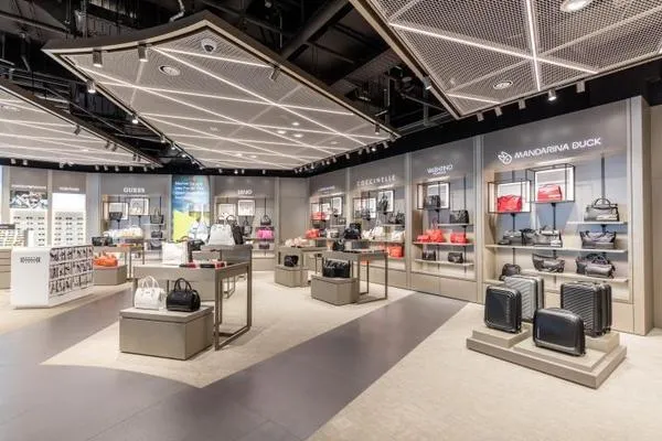
Once you research and understand how customers navigate your store, you can start influencing how they interact with the merchandise. The foundation for this strategy is the design of your store floor plan. To create an environment that strategically emphasizes the desired purchasing behavior, it is essential to use all of the floor space you have allotted for merchandise, base your layout on the principles of customer behavior, and not sacrifice customer flow for artistic taste. With these factors in mind, the following are common store layouts for your consideration.
Forced-Path Store Layout
This layout directs the customer on a predetermined route through the retail store. Research shows that, with this type of store layout, achieves a uniform and efficient customer flow that promotes higher sales.The advantage of a forced-path layout: Every aisle in the store is maximized. With customers exposed to all of the merchandise offered, this design might entice the customer to make an unplanned purchase. 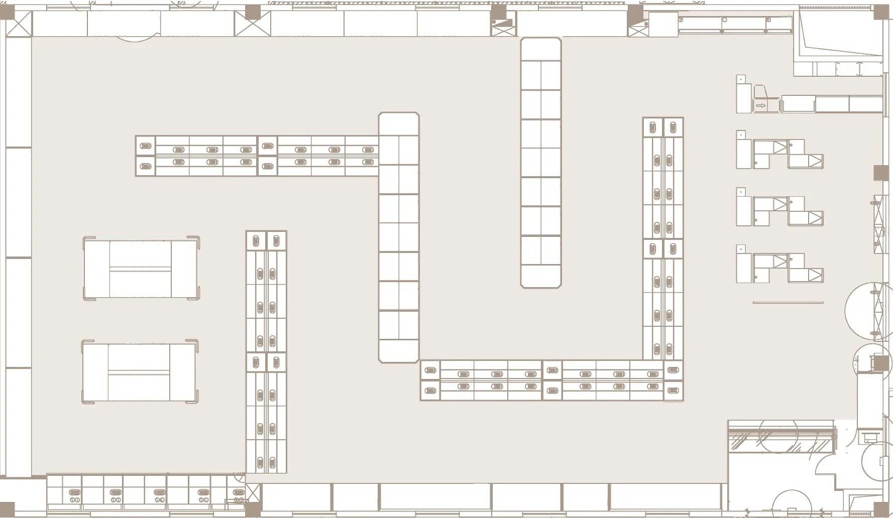
However, he points out that using this store layout risks irritating shoppers that have a specific task and desired location, and could also overwhelm shoppers by hurrying them through an experience of customers all moving in one direction together, quickly.
Grid Store Layout
The grid store layout design is a familiar, repetitive pattern, there are multiple advantages to the grid layout, including the following:
- Customers can move quickly through an efficient floor space using standard fixtures and displays.
- The presentation is uniform and comfortable due to its popularity, creating a seamless customer experience.
- Design simplifies inventory control for the retailer - a key to retail strategy that leverages store design to maximize profitability.
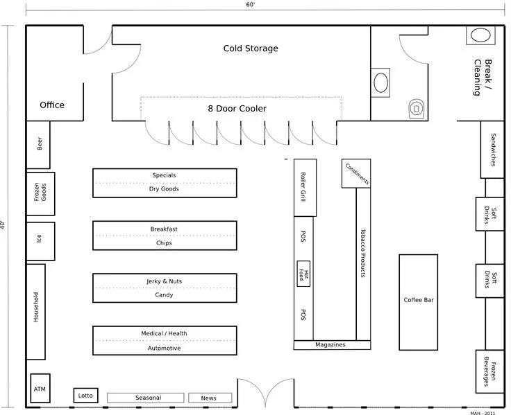
However, the downside of this layout is the lack of aesthetics and the “sterile and uninspiring” environment often associated with its use. To counter this, effective signage to guide customers and create a “cognitive map” of the store.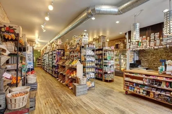
Loop Store Layout
Also known as the “racetrack” layout, think of the loop design as the “yellow brick road” of retail store layouts. This analogy to describe the way a loop store layout uses a path to lead customers from the entrance of the store to the checkout area. This is a versatile choice for store design when implemented with another layout style or used as a prominent feature of the retail store. This layout for a larger retail space (over 5,000 square feet) and encourages a clear and visible loop for customer flow. 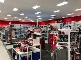
Designers accomplish the loop effect by making the floor path a standout color, lighting the loop to guide the customer, or using a different floor material to mark the loop. Lines are not recommended, as they can be a psychological barrier to some customers, potentially discouraging them from stepping away from the loop and interacting with merchandise. A loop design that rewards the customer with interesting visual displays and focal points on the way to the checkout area.
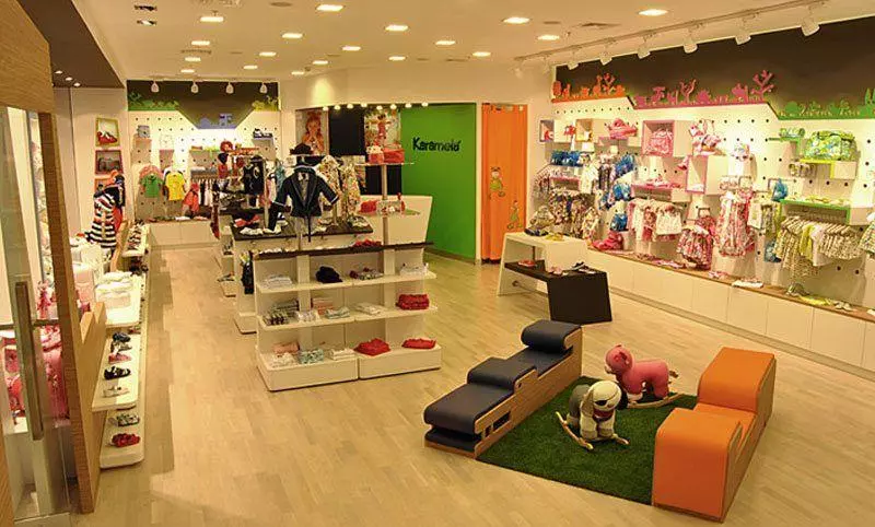
Straight Store Layout
The straight store layout is efficient, simple to plan, and capable of creating individual spaces for the customer. Plus, a basic straight design helps pull customers towards featured merchandise in the back of the store. Merchandise displays and signage is used to keep customers moving and interested. 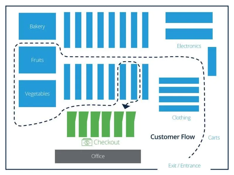
Liquor stores, convenience stores, and small markets use the straight design efficiently. However, the drawback is the simplicity: Depending on how a customer enters the store and moves past the transition zone, it may be more difficult to highlight merchandise or draw them to a specific location.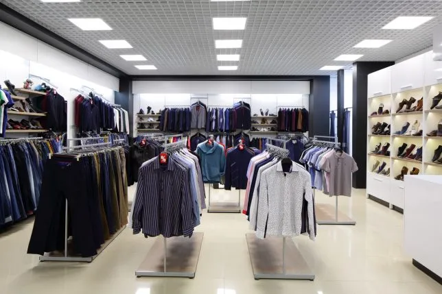
Diagonal Store Layout
Just as the name implies, the diagonal store layout uses aisles placed at angles to increase customer sightlines and expose new merchandise as customers navigate through the space. A variation of the grid layout, the design helps guide customers to the checkout area. Small stores can benefit from this space management option, and it is excellent for self-service retailers because it invites more movement and better customer circulation. 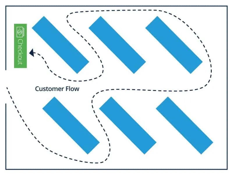
When the checkout is located in the center and possibly raised up, the diagonal layout offers better security and loss prevention due to the extra sightline effect. The downside of this layout is that it doesn’t enable the customer to shortcut toward specific merchandise, and the risk of narrow aisles is higher.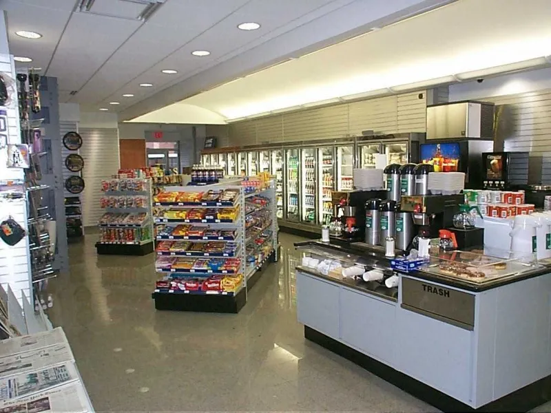
Angular Store Layout
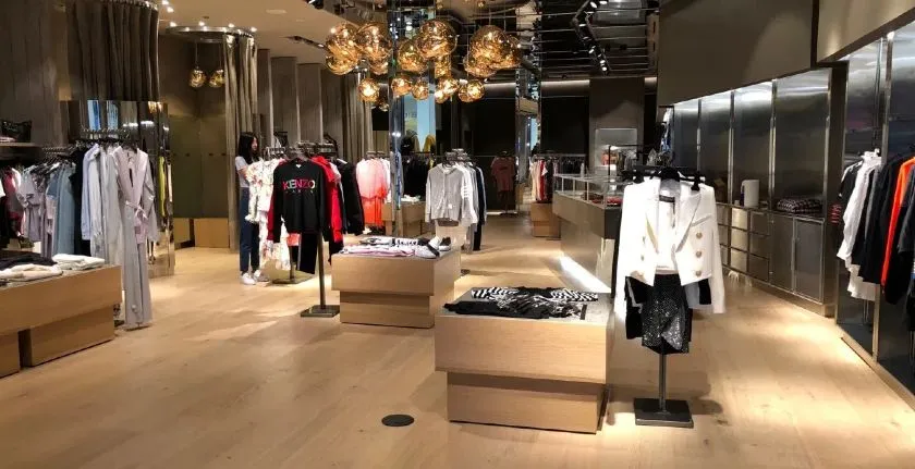
The name of this design is deceptive, as the “angular” store layout relies on curved walls and corners, rounded merchandise displays, and other curved fixtures to manage the customer flow. Luxury stores use this layout effectively because, 
There is a perception of higher quality merchandise that the angular layout leverages to target the appropriate customer behavior in that environment. And although this design sacrifices efficient space use, because of the rounded displays and limited shelf space, if a retailer has sufficient inventory storage away from the sales floor, this layout is useful in creating a unique perception.
Geometric Store Layout
Popular with retailers targeting trendy millennials and Generation Z demographics, a geometric layout offers artistic expression and function when combined with the appropriate displays and fixtures. The unique architecture of some retail stores, including wall angles, support columns, and different ceiling styles mix well with the uniqueness of a geometric layout.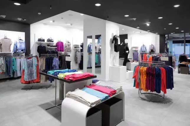
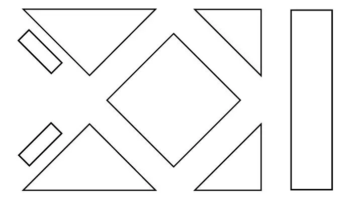
Merchandise displays and fixtures of various geometric shapes and sizes combine to make a statement, often as an extension of the retailer's overall brand identity. Clothing and apparel stores use a variety of environmental merchandising strategies (for example, music, scents, and artwork) with the geometric layout to enhance the customer experience.
Mixed Store Layout
The mixed store layout uses design elements from multiple layouts to create a flexible option for retailers. Department stores use a compelling mix of straight, diagonal, and angular concepts, among other design elements, to create a dynamic flow through a range of departments featuring a variety of merchandise. 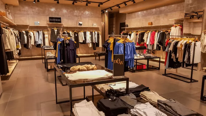
Large grocery store chains also successfully combine mixed store layout elements. For example, customers have the flexibility to navigate through a grid layout for their basic groceries but feel compelled to search the angular displays featuring high-margin wine, beer, and imported cheeses. The advantages of combining different store layouts seems apparent, but the space and resource requirements to maintain this design can pose difficulties to retailers.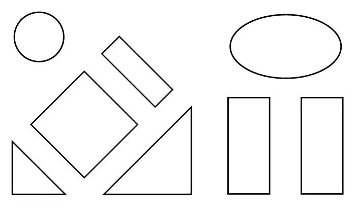
Free Flow Store Layout
A free flow layout rejects typical design patterns and styles commonly used to influence customer behavior. In a free flow layout, the intent is not to lead the customer using predictable design patterns, displays, or signage. There are no specific design rules followed for this retail store design, and customers have more liberty to interact with merchandise and navigate on their own. For this reason, the free flow layout is sophisticated in its simplicity.
Customers feel less rushed in this creative environment. Retail stores look less sterile in the free flow design, and merchandise may seem more intriguing. The only limitation for retailers using this layout is the overall space available, but that doesn’t mean that the research on customer navigation behavior and tendencies shouldn’t be accounted for as well. The main disadvantage to this experimental design layout is the risk of confusing customers past the point of their preferred behavior and disrupting customer flow.